In today’s world, log management software is utilized to monitor the logs of all network devices, servers, databases, and firewall structures. While the options provided by these products vary, diversity is rapidly increasing day by day. Log management products continue to address simultaneous tracking issues by making various additions to their structures in line with current needs. For instance, many of us are familiar with the applications related to tracking remote workspaces provided by Splunk in recent times. By taking the time to examine and develop these studies, we can obtain highly useful dashboards and make various changes to integrate them into our own structure. In this article, I will delve into the dashboard structures and configurations within the Splunk product and the apps it provides for log tracking.
Let’s start by discussing resource-based apps in the Splunk structure. Then we’ll seek answers to what the dashboards obtained with these apps provide us and what we can do to optimize the benefit we derive. Enjoy the read.
The Splunk App structure can be seen as a collection of applications developed to function on the Splunk platform. These apps are fed from different sources and objects, containing various interfaces, dashboards, ready-made reports, and saved searches for the user. In essence, Splunk Apps are ready-made packages prepared for end-users to facilitate the analysis of data sources in line with the variable needs of each structure and individual. To include these apps in the structure, it’s sufficient to upload the relevant app file from the “App Management” tab. Subsequently, when extra configurations are desired, the process can be performed by editing the config files in the relevant paths on the Web UI or server.
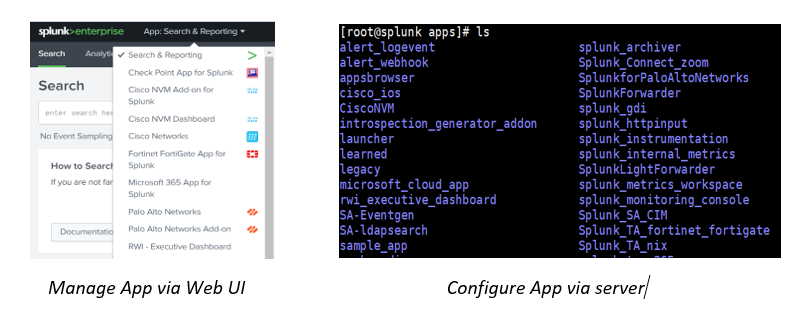
Splunk Apps can be accessed via the https://splunkbase.splunk.com/ site.

Among hundreds of apps, any free app can be imported to Splunk Enterprise or Splunk Cloud environment for examining dashboard structures. To explore dashboard structures, apps such as “Remote Work Insight” or “Zoom App for Splunk,” created to facilitate tracking of remote workspaces, which have recently become the center of attention, can be used. These two apps include various dashboards provided by Splunk and related to Zoom Meeting, Office 365, Okta, and VPN logs.
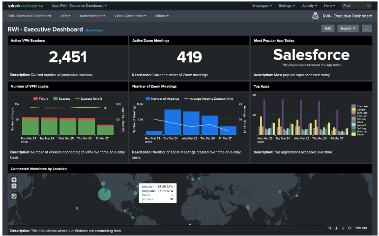
The Remote Work Insight App is a package prepared to provide users with 4 main dashboards to manage and monitor the remote working environment. Since the app in question processes logs from different sources, it should be ensured that the product app and add-ons of these sources are included in the structure, and that the sourcetypes can be matched correctly. For example, “Microsoft 365 App for Splunk” and “Splunk Connect for Zoom” can be mentioned. However, to integrate dashboards based on certain source types into our own structure, minor changes need to be made to the app. When browsing through the dashboards and panels in the app content, the titles in the table are visible.
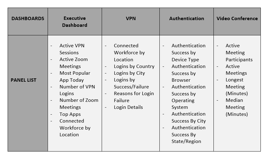
Dashboards and panels mentioned above are fed by realtime searches running in the background and present dynamic information with variable visuals. The searches that feed the dashboards can be configured with datamodel or basic search strings. The time range for these searches can optionally be set to realtime or based on a certain time period. This way, both the metrics of remote workspaces can be monitored in real-time and the activity trends within a certain time period can be analyzed.
Dashboards can be configured to be accessible to all users, and access permissions can be changed depending on the classification between various business lines. Configuration changes can be made on the ready-made dashboards that come with the apps, as well as new dashboards configured from scratch can be added to existing apps in line with the needs.
Another app within the framework of changing monitoring areas with the spread of remote workspaces can be considered as the “Splunk App for Zoom”. This app is also necessary in terms of feeding the “Video Conferencing” dashboards within RWI. The app provides the following topics:


The app, which provides simultaneous and retrospective visualization of the activity logs of the Zoom application, provides the logs of the application in the background with another app, “Connect for Zoom”. As can be seen, there are operational links between the apps. Dashboards in an app can be fed from sources that provide log retrieval with another app in the background.
By making various configurations on the Zoom account defined for the “Splunk App for Zoom”, the logs of the application can be transferred to Splunk thanks to the “Connect for Zoom” app. Thanks to the logs received from the cloud, “Active Meetings”, “Number of Zoom Participants”, and many other panels provide visual tracking.
Following the overview of the “Remote Work Insight” and “Splunk App for Zoom” apps provided by Splunk, we can examine how to make changes to the dashboards in the apps or how to create a dashboard from scratch. Identifying a sample resource to dictate these topics will be useful to clarify the working lines. For example, we can focus on the VPN activities of the users through the Mobile Access logs of the CheckPoint product and then create a dashboard.
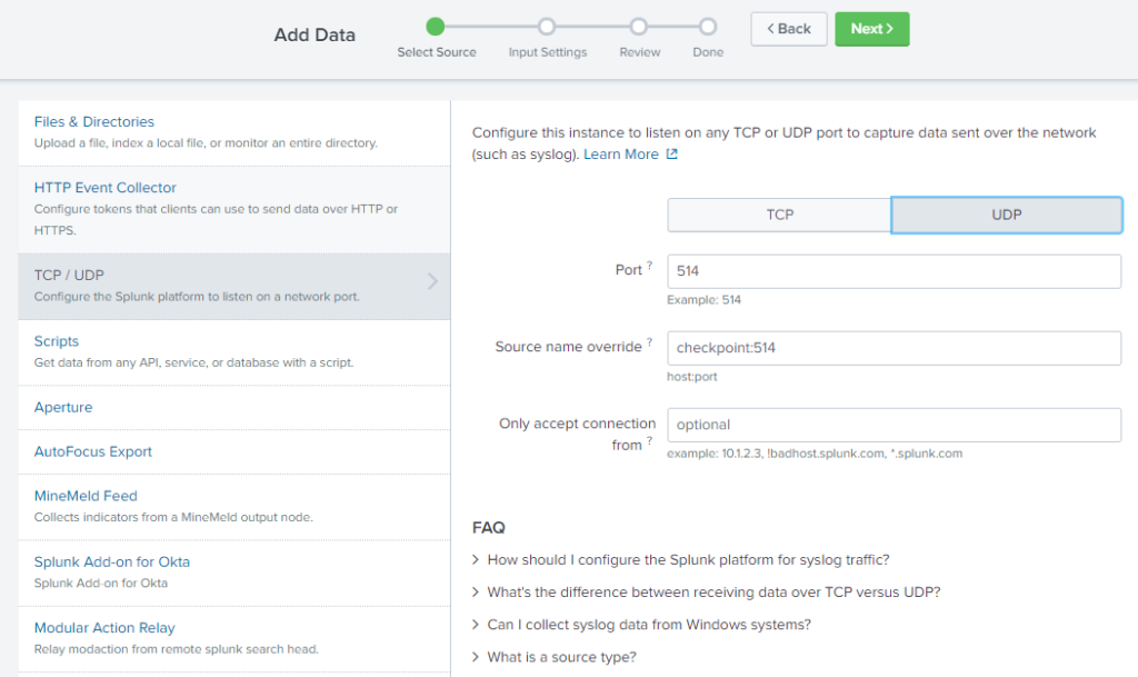
To receive the syslog 514 UDP packets sent by CheckPoint with the correct source type definitions in Splunk, the CheckPoint product app must first be imported into the system. With the addition of the “Check Point App for Splunk” app, the new sourcetype called “cp_log” is automatically added. After this process, syslog input configurations are performed in the “Data Input” section as shown below.
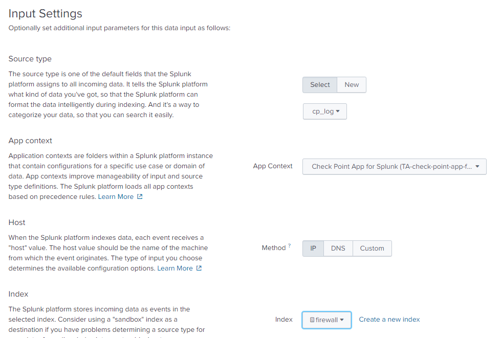
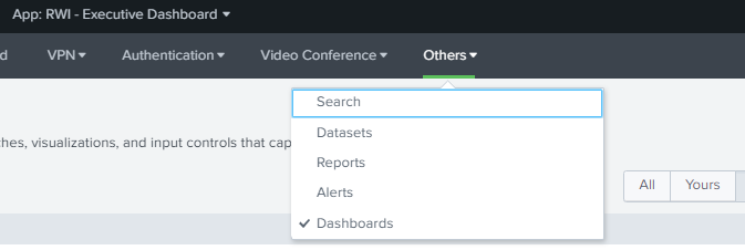
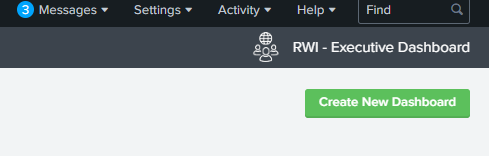
After completing the necessary configurations for transferring CheckPoint logs to the Splunk environment, the relevant app is selected to define additional dashboard settings in the RWI app. To create a new dashboard, the “New Dashboard” option is selected from the “Others” tab in the Dashboard section.
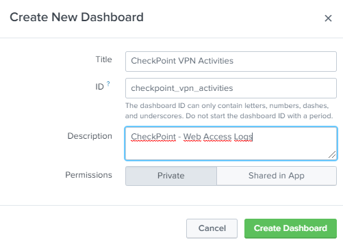
Title, ID, and Description for the dashboard should be set in accordance with the content, considering that there may be multiple dashboards.
For example, a Panel showing Successful VPN Login activities is created. The search string to be used for this operation can be tested in the Search screen.
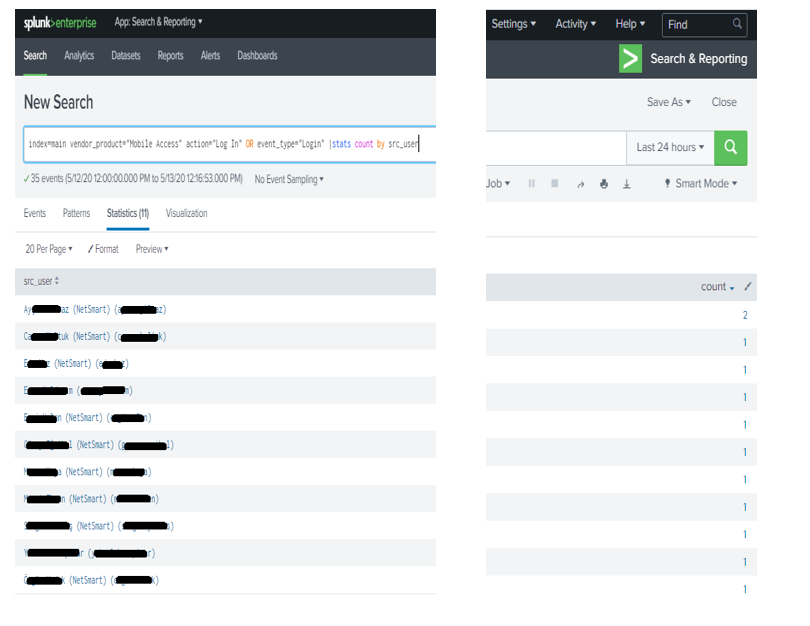
Due to the |stats command, the results are listed as statistical data. These data can be transformed into visual tables in different formats using the options available in the Visualization section.
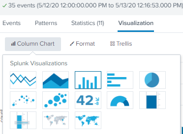
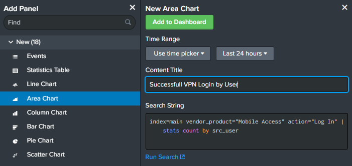
After testing the search string in the “Search & Reporting” section, the process of adding the newly created “CheckPoint VPN Activities” dashboard to the panel is initiated in the relevant app. In this section, Panel Title, time range, and search string definitions are made, and then “Add to Dashboard” is selected to proceed.
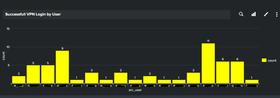
The configured search works in the background for the selected time range and is positioned on the dashboard in the selected Visualization format.
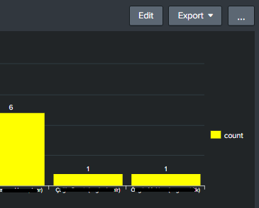
When we want to make changes to the existing dashboard, we can select the “Edit” button located at the top right. In this section, there are many options such as adding input to the current panel, changing the panel visual, editing colors, changing the time range, and search string.
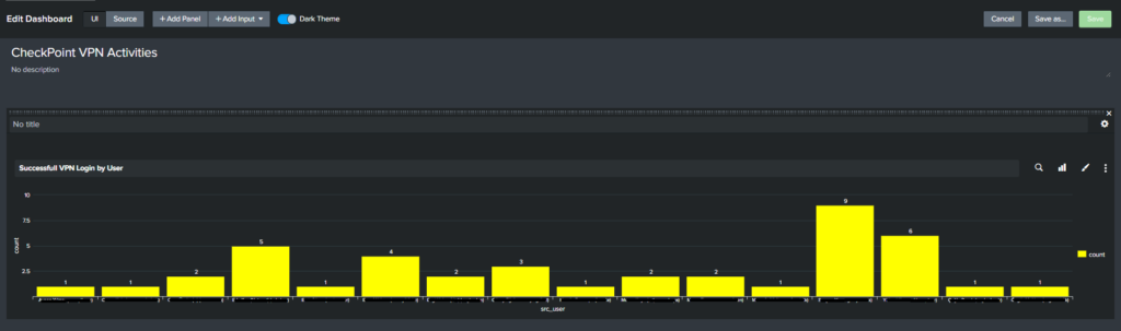
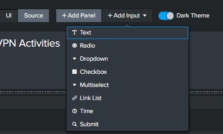
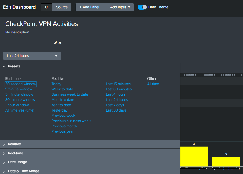
For example, to have a “time range picker” button on the dashboard, the Time section is selected in the Data Input area, and then the “time” button with the default value specified is added as input to the dashboard.
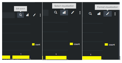
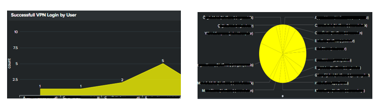
The Panel initially created as an Area Chart in the “Select visualization” section can be changed to Pie Chart, Bar Chart, Line Chart, etc.
Additionally, visual configurations used in dashboards can also be provided by going to the relevant XML in the “Edit Dashboard > Source” section and making changes there.
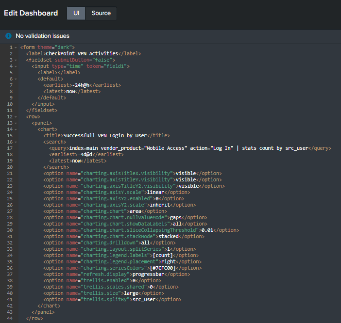
For example, when a color change is desired on the Pie Chart, the section “[#7CFC00]” can be edited.
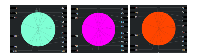
The default visualization methods available in Splunk are as shown below. Additional options may require the use of different Visualization Apps.
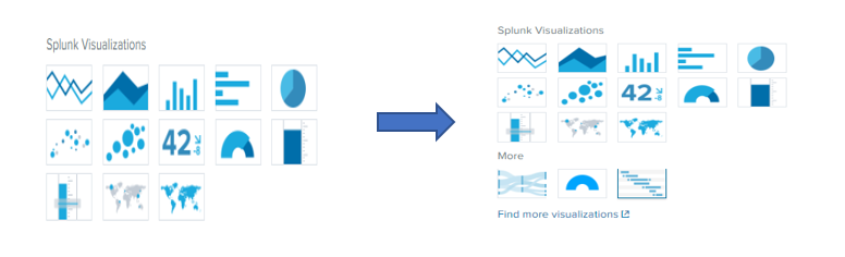
For example, to use the Timeline option, we can obtain the relevant app from the splunkbase site and upload it to the Splunk App section. We can also download and include “Sankey-Diagrams” and “Semicircle donut” apps to use in other dashboards.
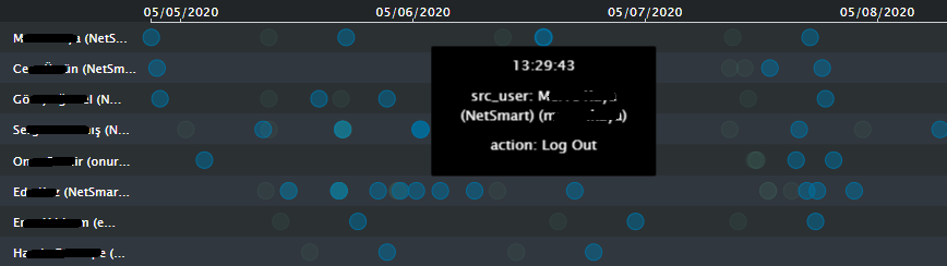
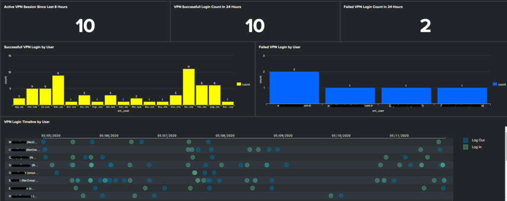
An example of a panel prepared using the timeline visualization is shown below. Thus, VPN login-logout events within the selected time range based on user and date can be seen.

It may also be desired to check from which locations VPN logins are made in real-time, in addition to the importance of user login/logout events and VPN durations. In this regard, the “iplocation” command needs to be used.
For this function to be enabled and to provide correct data, the GeoLite2-City.mmdb library must be obtained from http://dev.maxmind.com/geoip/geoip2/geolite2/ address and imported to the $SPLUNK_HOME/share/ path on the Splunk server. After this process, location information in the logs can be accessed with the “|iplocation” command.
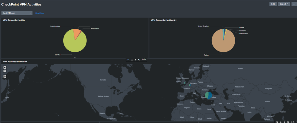
Following the download and inclusion of the relevant library in the structure, dashboard panels titled “VPN Login by City” and “VPN Login by Country” can also be created.
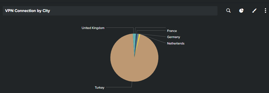
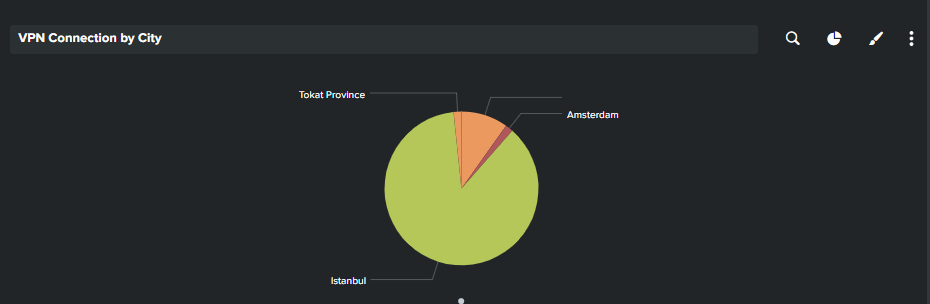
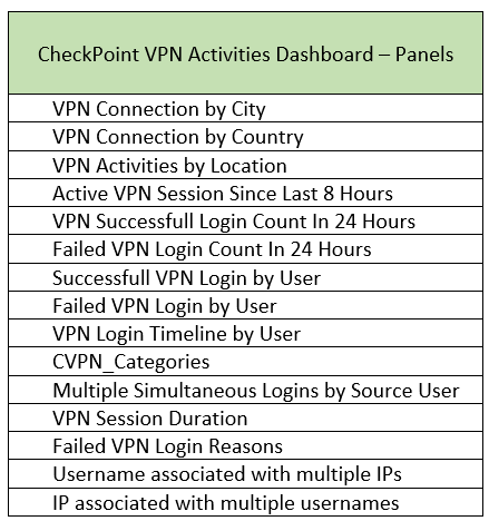
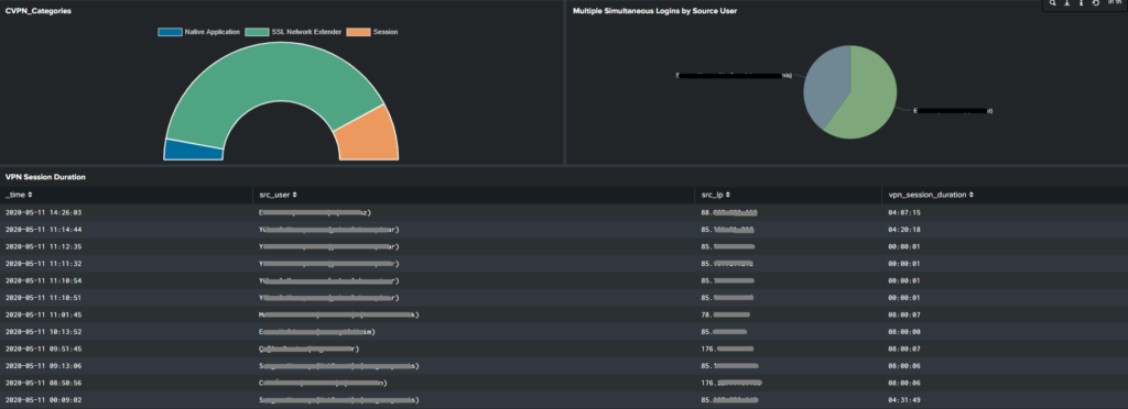
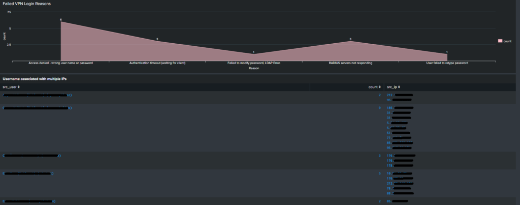
With all these configurations, we can change the dashboard structures in parallel with changing needs and create our own dashboards. Finally, we can review the panel titles in our dashboard named “CheckPoint VPN Activities”.
Stay tuned for more blog posts on netsmartsecurity.nl
Thanks for reading! Share this post if you found it helpful.
Stay curious and keep learning.
Follow Netsmart on Linkedin to stay up to date!


The rise of quantum computing introduces significant challenges to existing cryptographic systems.

In today’s post we’ll explain how to simulate Active Directory attacks using Splunk and various tools to improve an organization’s security posture.

In this blog post, we will cut through the confusion and explain the core differences between SIEM and SOAR, two essential security tools used to protect your organization.

The privileged accounts of organizations play an important role in today’s cybersecurity ecosystem. Protecting these accounts and the critical resources they access has become crucial for organizations to manage, control, and audit all privileged account activities.